Game Night Sundae Bar
Game Night Sundae Bar: A Shake, Rattle & Roll Ice Cream Bar Setup
A game night sundae bar turns dessert into an interactive station where guests build their own ice cream creations between rounds of cards, board games, or dominoes.
Most sundae bar content treats setup like a chore — buy ice cream, find some bowls, dump out toppings, hope it looks good. That approach leaves you standing in the kitchen wondering if you forgot something, staring at a random pile of stuff that doesn’t quite come together.
Here’s what changes everything: a theme. Not the kind you announce with signs, but the kind that gives you a framework for every decision you make. Shake, Rattle and Roll isn’t just a cute name for a game night sundae bar. It’s an organizing principle that makes sourcing intentional, setup cohesive, and the whole process genuinely fun to pull together.
When you know you’re looking for toppings that shake, elements that rattle, and treats shaped like rolls, shopping stops feeling like guesswork. You’re not randomly grabbing sprinkles and hoping they work. You’re building something with a clear vision, and that makes all the difference.
How to Set Up a Game Night Sundae Bar
Without a theme, you end up with the sundae bar equivalent of throwing darts at a menu. A few generic bowls. Some toppings that seemed like a good idea in the store. Ice cream still in the carton because you ran out of time to make it look intentional.
The Shake, Rattle and Roll framework solves that. Every item you source fits into one of three categories, which means you’re shopping with purpose instead of panic. The primary color palette — red, yellow, blue — comes straight from classic game boards like Sorry, Monopoly, and Twister. It’s instantly recognizable as game night without being literal or kitschy.
When your six-year-old niece and your college roommate both immediately get the vibe, you’ve nailed it.
Shake: The Toppings That Move
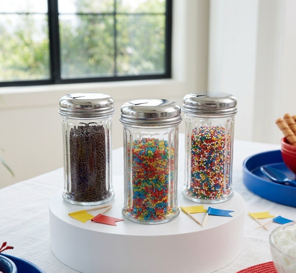
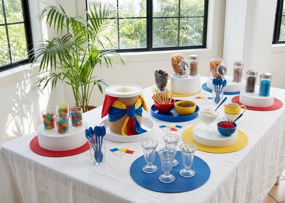
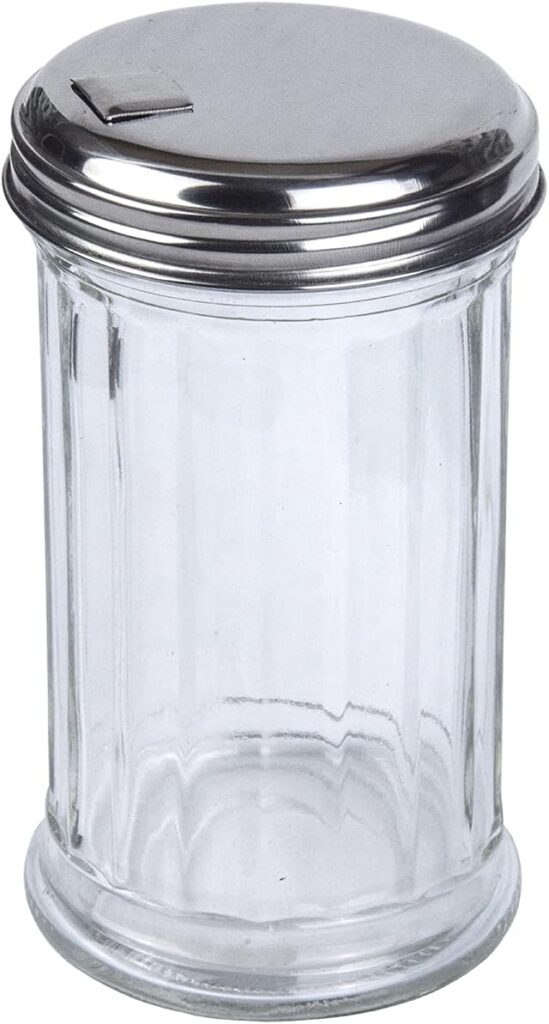
The Shake category is about toppings that flow, pour, and cascade. Chrome sugar dispensers — the kind you’d see in a classic diner — hold rainbow sprinkles, chocolate jimmies, and colored sanding sugar. The flip-top pour spouts make them easy to use, and the repetition of chrome-and-glass across the table creates visual rhythm without clutter.
These aren’t just functional. They’re part of the aesthetic. The retro soda fountain vibe plays perfectly into the game night theme, and the chrome catches light in a way that makes the whole station feel polished.
Fill each dispenser with a different sprinkle type. Guests tilt, pour, watch the cascade of color hit their sundae. It’s a small moment, but it’s tactile and satisfying in a way that scooping from a bowl isn’t.
Rattle: The Game Night Anchor
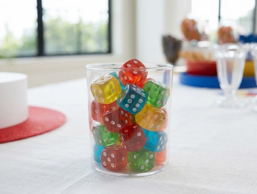
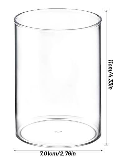
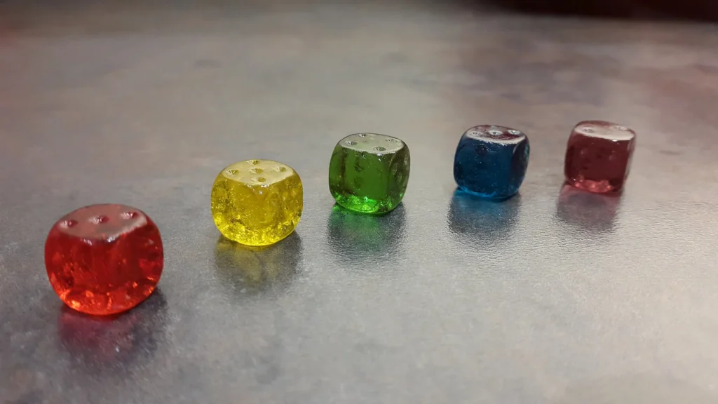
This is where the theme becomes unmistakable. Clear dice cups filled with translucent gummy dice aren’t just decoration — they’re the visual hook that tells guests exactly what kind of party this is. The jewel-toned gummies catch light, the white dots on each face are clearly visible, and the cups themselves invite interaction.
Guests can grab a few dice, drop them onto their sundae as edible garnish, or just appreciate the playful detail. The dice don’t need to do anything beyond exist. Their presence signals that this isn’t a generic ice cream bar — it’s a game night sundae bar, and every element was chosen with intention.
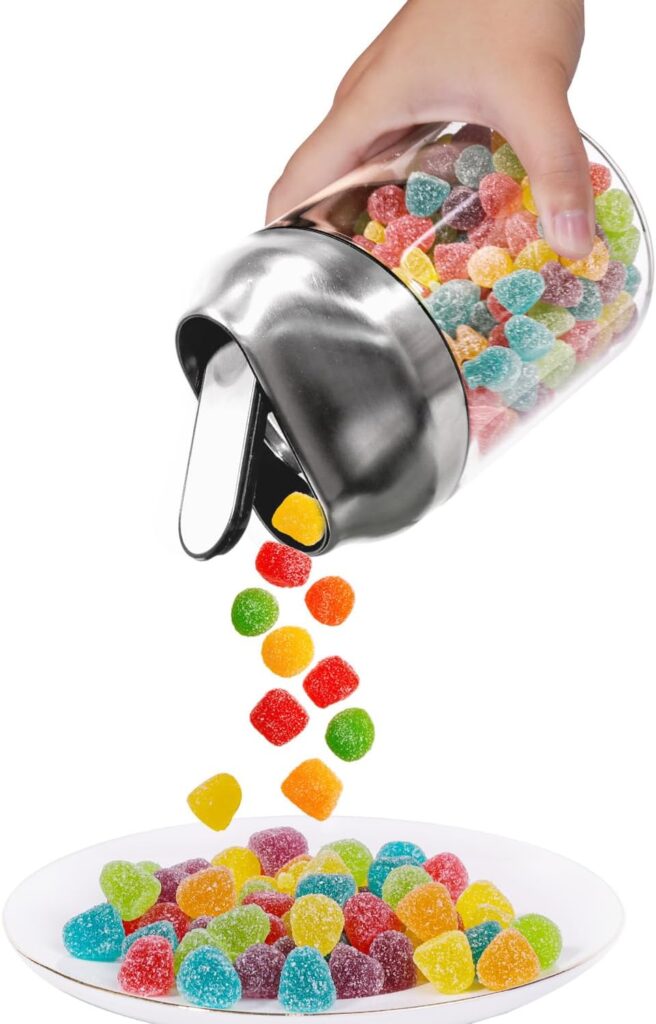
Beyond the gummy dice, the Rattle category includes chrome candy dispensers with trigger levers. Tilt the glass jar, press the lever, and M&Ms or Reese’s Pieces tumble out into your hand. The mechanism makes getting candy feel like part of the game. Crushed Oreos in a third dispenser round out the options.
The repetition of chrome dispensers — some for sprinkles, some for candy — creates a cohesive look without requiring you to overthink placement. Scatter them across the table, elevate a few on white risers for height variation, and you’re done.
Roll: The Cylindrical Toppings
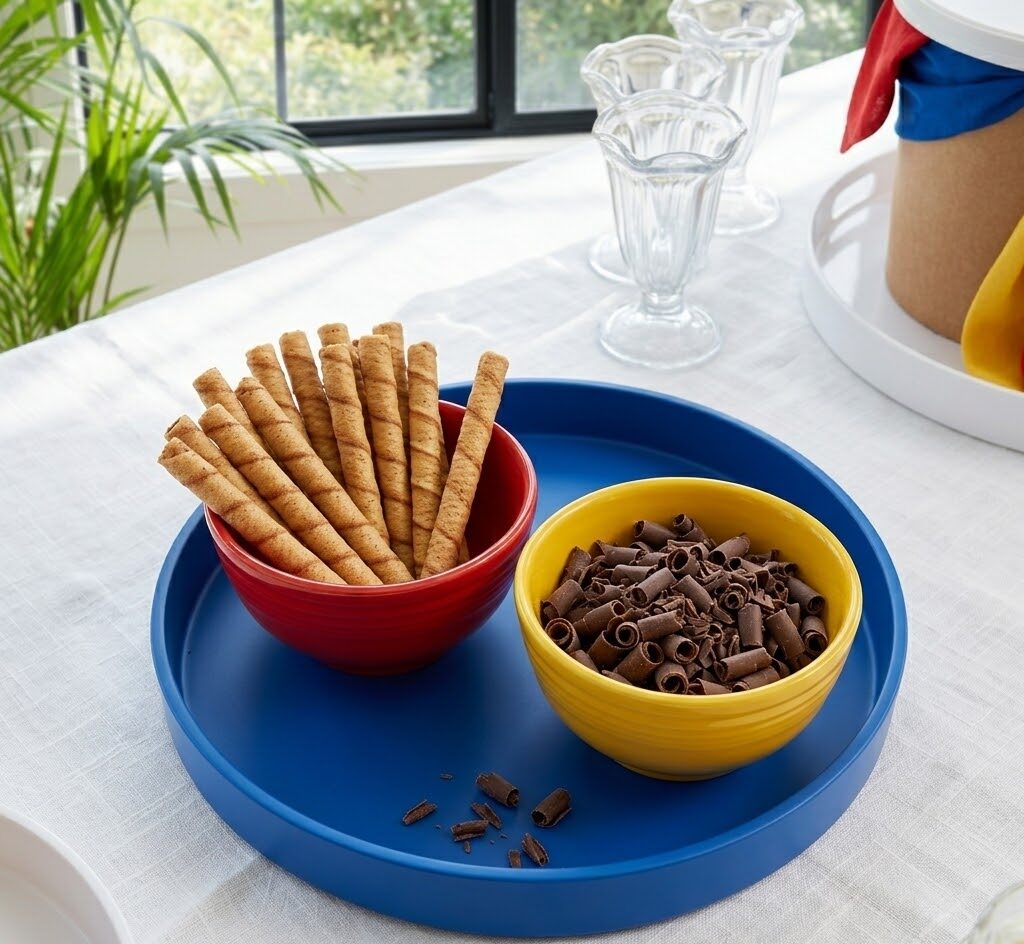
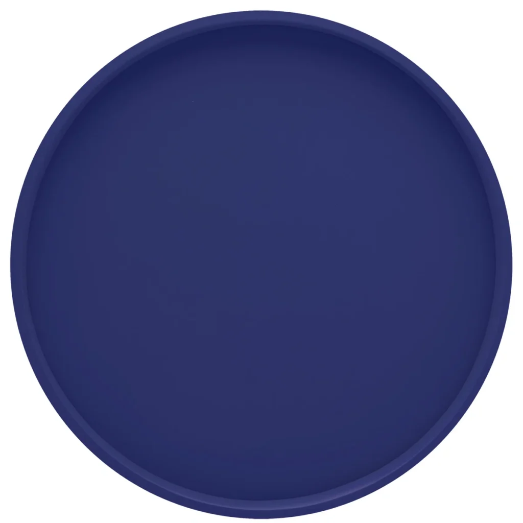
Pirouette cookies and chocolate curls don’t just taste good. Their shape reinforces the roll-the-dice theme in a way that’s visually obvious but never heavy-handed. The royal blue tray holding a red bowl (pirouettes) and yellow bowl (chocolate curls) demonstrates intentional primary color layering. Blue tray, red bowl, yellow bowl — three colors working together without overwhelming the table.
Stand the pirouettes upright in the bowl so they become a sculptural element, not just scattered cookies. The chocolate curls, formed into tight cylinders, sit in the yellow bowl with a few extras scattered on the blue tray for a natural, unstaged look.
This is the kind of small detail that separates a thoughtfully styled station from one that was thrown together at the last minute. You’re not doing more work — you’re just doing it with a clear vision.
The Supporting Cast: Sauces, Whipped Cream, and Ice Cream
Not everything fits neatly into Shake, Rattle, or Roll, and that’s fine. Some elements are classics for a reason.
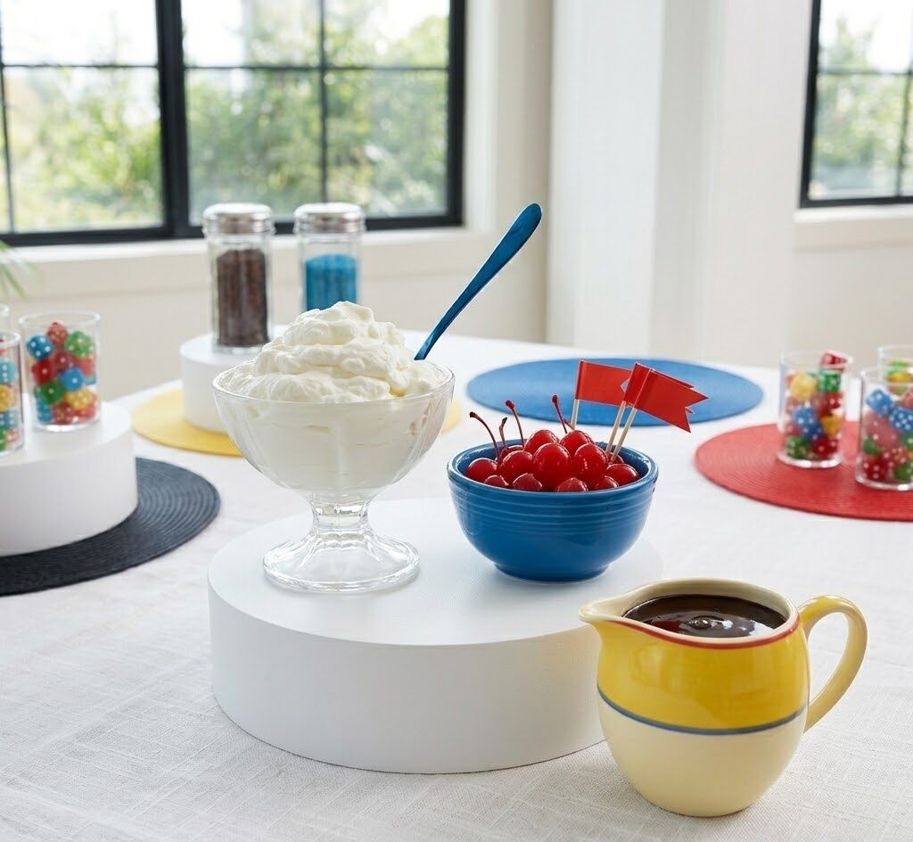
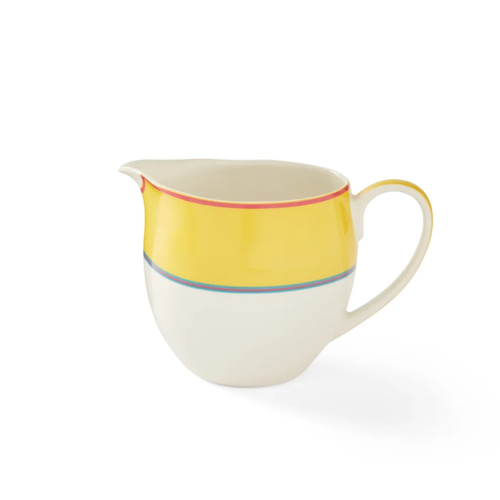
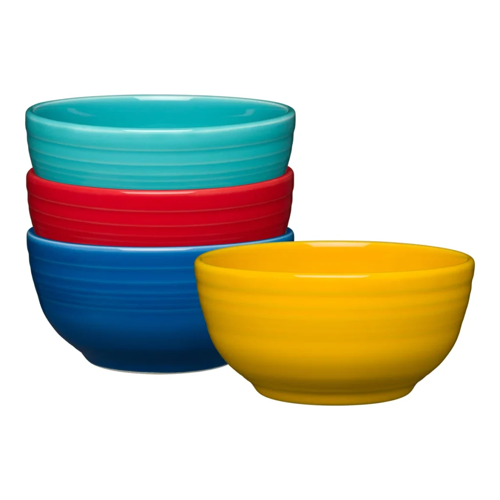
Real whipped cream — the kind you make from heavy cream, not a can — sits in a clear footed glass bowl on a white riser. The pedestal base elevates it from just another topping to a featured element. Next to it, a blue Fiestaware bowl holds maraschino cherries with stems. A yellow ceramic pitcher (with red and blue trim bands that echo the napkin wrap) holds hot fudge or caramel sauce.
These wet toppings can’t be shaken or rattled, but they’re essential. Grouping them together on a riser keeps the station organized and makes it easy for guests to navigate.
The ice cream itself stays in the tub. Scooping individual balls ahead of time just means racing against melting while you’re trying to set everything up. Keep the vanilla in its 3-gallon container, but don’t leave it looking utilitarian.
Three cloth napkins — one red, one yellow, one blue — tied together in a cascading bow around the tub turn cardboard packaging into a centerpiece. It’s the champagne-bottle treatment for ice cream, and it takes thirty seconds. The tri-color bow becomes the visual anchor that everything else radiates from.
One practical note: turn your freezer to its coldest setting the day before and move the tub to the back. Commercial ice cream shops store tubs in freezers set much colder than home units, which is why their ice cream stays firm longer. The extra-cold freeze buys you time so the station can stay out during the party without turning into soup.
Layout: Making It All Work Together
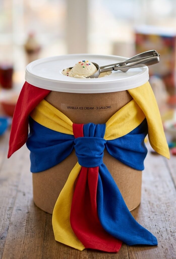
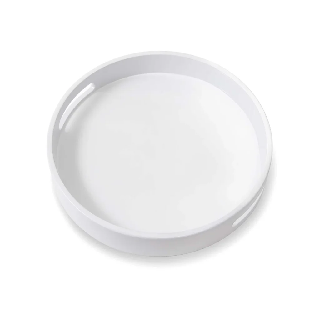
The napkin-wrapped ice cream tub sits on a round white tray in the center-left of the table. It’s the anchor. Everything else gets positioned around it.
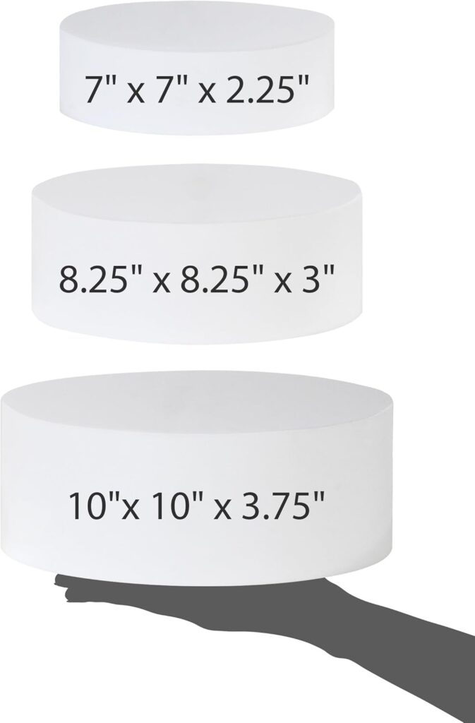
White cylindrical risers create three tiers of height. The smallest (7 inches) holds the whipped cream and cherries. The medium riser (8.25 inches) elevates a few chrome dispensers. The largest (10 inches) serves as a platform for the clear dice cups clustered together.
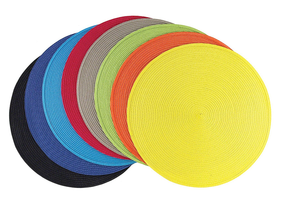
Round woven placemats in red, yellow, and blue go under select items — not everything. One placemat under a chrome dispenser, another under the yellow pitcher, a third under the royal blue tray. The circles echo Twister’s graphic language without needing an actual mat cluttering the table. Distribute the three colors across different zones so no two identical colors sit next to each other.
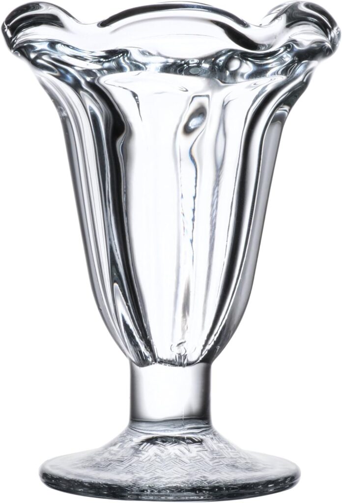
Chrome dispensers, primary-colored bowls, and clear glass elements (dice cups, whipped cream bowl, tulip sundae glasses) create a visual rhythm. The chrome adds sparkle, the primary colors provide bold graphic punch, and the clear glass offers breathing room so the table doesn’t feel visually crowded.
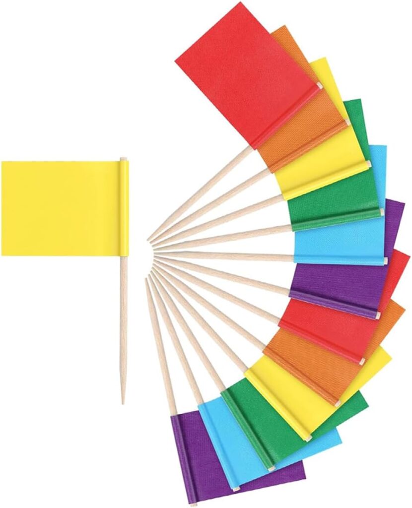
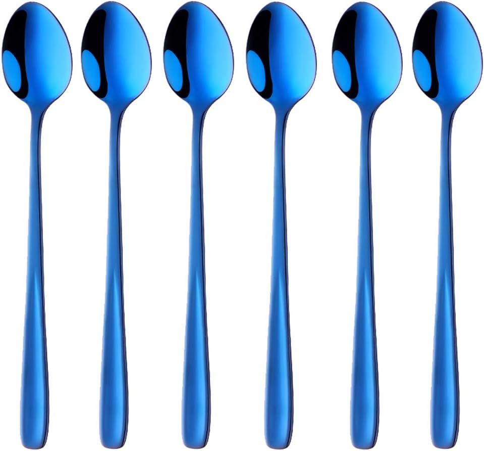
Stack the clear tulip-shaped sundae glasses at the front edge where guests can grab them. Blue long-handled spoons rest in bowls that need serving utensils. Small cocktail flags in red, yellow, and blue (ignore the other colors in the pack) scatter across the table as tiny accent moments.
The setup should feel abundant but not cluttered. Leave white tablecloth visible between elements. The goal is intentional placement with room to breathe, not a crammed buffet.
How the Station Flows
The FLOWS methodology — Fully Stocked, Layered, Organized, Within Reach, Styled — is what separates a functional sundae bar from one that actually works when guests are using it.
Fully Stocked means you’re not running back to the kitchen mid-party. Chrome dispensers hold enough sprinkles and candy for a crowd. The ice cream tub is 3 gallons. The whipped cream bowl is generous. You’ve anticipated volume, not just variety.
Layered is the height strategy. Risers create three distinct tiers so guests can see everything at a glance. The napkin-wrapped tub anchors the center, chrome dispensers on mid-height risers create visual interest, and bowls at table level make scooping easy. Nothing hides behind anything else.
Organized means each category has a clear zone. Shake elements (chrome sugar dispensers) are grouped but distributed. Rattle elements (dice cups, candy dispensers) live in their own area. Roll toppings share the blue tray. Wet toppings (whipped cream, cherries, sauce) cluster on the small riser. Guests navigate intuitively without confusion.
Within Reach is about accessibility. The ice cream tub sits center-left where everyone can access it. Toppings radiate outward in a logical flow. Sundae glasses stack at the front edge. No one has to reach across the table or ask someone to pass a bowl. The layout anticipates movement and eliminates bottlenecks.
Styled is the polish that makes it feel intentional. Round placemats in primary colors anchor zones. Chrome catches light. Clear glass creates visual breaks. The tri-color napkin wrap transforms the ice cream tub from functional to focal. Every element serves a purpose, and nothing feels random.
FLOWS isn’t about adding complexity. It’s about making sure your setup actually works when ten people are building sundaes at once. The theme gets them to the table. FLOWS keeps them moving smoothly once they’re there.
Why This Works for Game Night
The beauty of a theme-driven sundae bar is that setup stops being a last-minute scramble and starts being part of the event. When you’re tying those three napkins around the ice cream tub or arranging pirouettes to stand upright in the red bowl, you’re not just prepping — you’re building anticipation.
Your guests arrive, see the tri-color bow and the gummy dice and the chrome dispensers catching light, and they immediately understand: someone put thought into this. It’s playful without being precious, polished without being stuffy, and every detail reinforces the same message: tonight is about fun.
Shake, Rattle and Roll gives you the framework. The primary colors give you the palette. The chrome, clear glass, and Fiestaware give you the materials. What you do with it — how you arrange the risers, which dispenser goes where, whether you add an extra bowl of chopped nuts or keep it minimal — that’s where your own style comes in.
But the baseline is set. You’re not guessing. You’re executing a vision, and that makes all the difference between a sundae bar that feels random and one that feels like it was always supposed to look exactly this way.
Shop the Elements
One Last Thing
If people don’t immediately recognize the Shake, Rattle and Roll concept when they walk up to the table, that’s fine. The theme isn’t for them — it’s for you. It’s the organizing principle that made sourcing clear, setup enjoyable, and the final result cohesive.
The gummy dice signal game night. The primary colors feel familiar and nostalgic. The chrome dispensers add a retro soda fountain polish. Guests don’t need to consciously decode the framework to appreciate that the whole thing works.
And when someone asks where you got the idea for the tri-color napkin wrap or why you chose those specific bowls, you can smile and say: it’s all part of the theme.