Pink Coffee Bar
The Problem With This Pink Coffee Bar
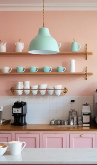
This pink coffee bar has excellent fundamentals. The pink cabinets commit to a color story. The jadeite pendant and dishware collection provide vintage-inspired contrast. The open shelving keeps essentials within reach while displaying collectibles. The layout is functional.
But it’s missing something critical: personality.
The shelves are organized but sparse. The jadeite collection is present but not fully leveraged. The wall above the workspace is blank. The accessories are purely utilitarian—no layers, no styling moments, no visual interest beyond the collectibles. This coffee bar works, but it doesn’t charm. It handles coffee-making logistics without creating the kind of space that makes you want to linger over your morning cup.
This is where most pink coffee bars stall out. Function is solved, but character never arrives.
What’s Actually Missing
The gap between functional and styled comes down to three specific elements:
Wall interest. That blank wall above the shelf needs art that reinforces the color story without resorting to cutesy coffee signs. The space needs visual weight up high.
Curated collection display. The jadeite pieces are a great start, but the shelves need more to fill the visual space—either additional jadeite to build out the collection or complementary collectibles that work with the vintage-inspired aesthetic. Collections need volume to make an impact.
Layered styling. The countertop is flat. There’s no height variation, no grouped vignettes, no intentional arrangements. Everything sits at the same elevation doing its job without creating composition.
Texture and material variety. Pink cabinets and jadeite accents establish color, but the space lacks material interest—no natural elements, no metallics, no textural contrast to create depth.
This isn’t about adding more stuff. It’s about adding the right stuff in the right way.
The Transformation: 12 Accessories That Add Personality
Here’s exactly what this pink coffee bar needs—and how to use each piece to create a styled station rather than just a functional one.
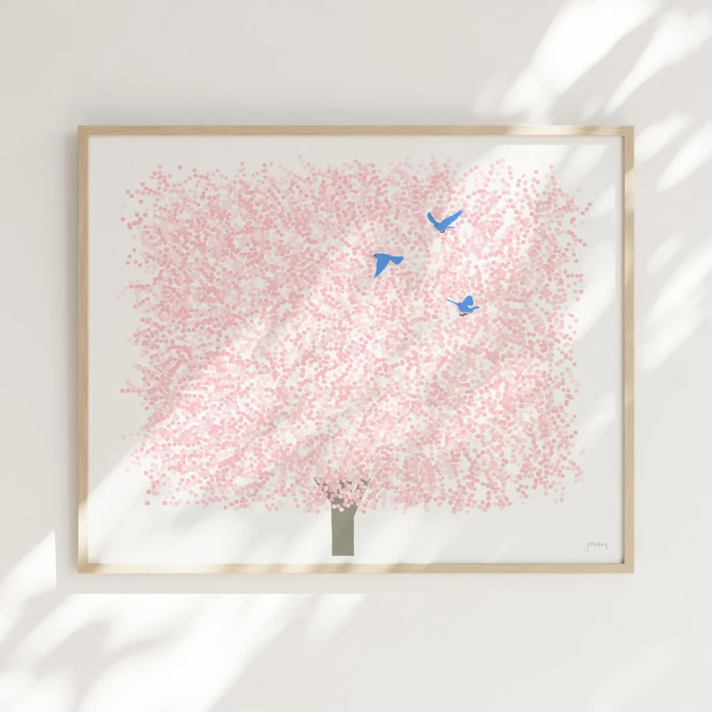
1. Cherry Blossom Art Print
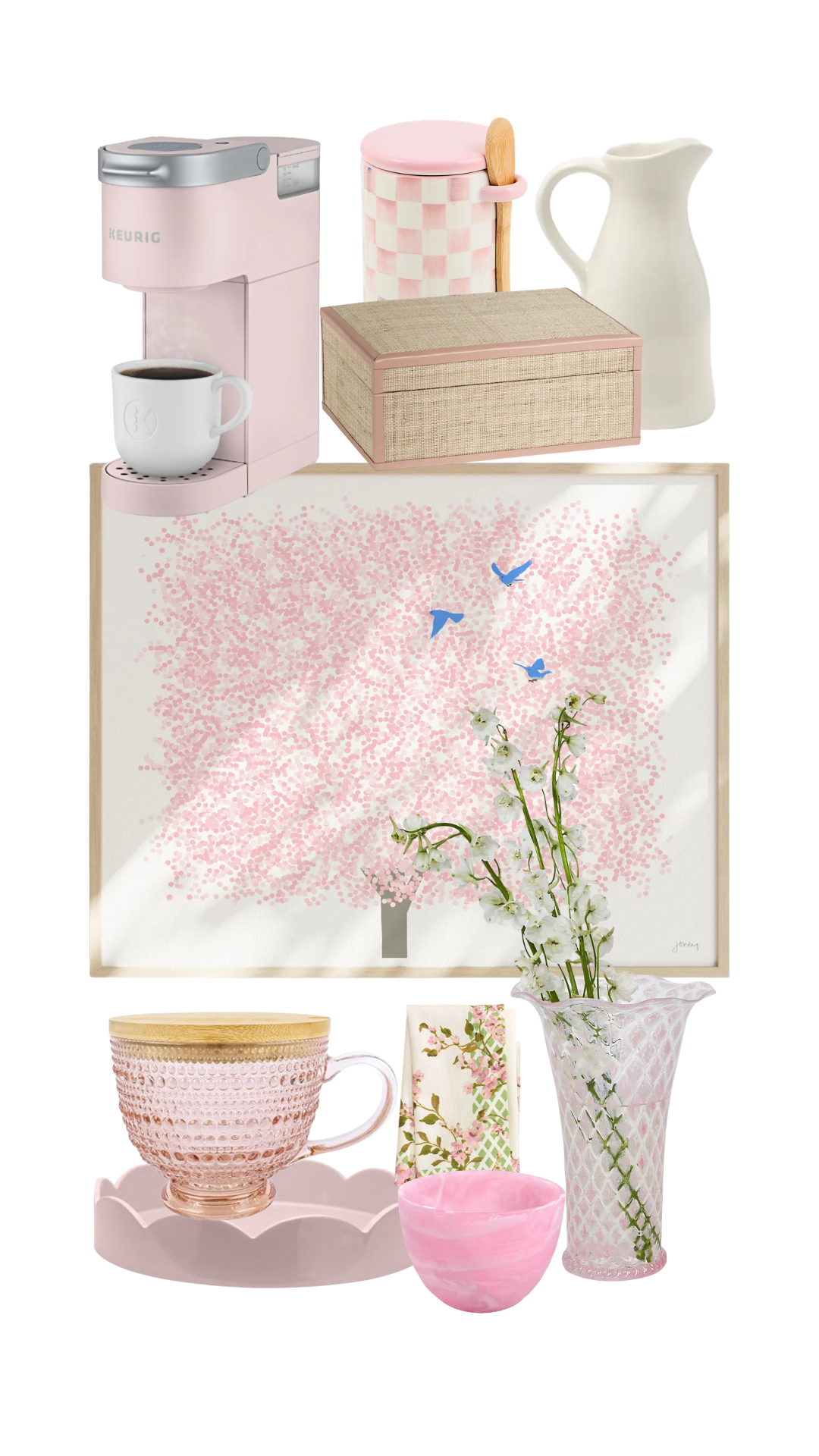
The blank wall needs a focal point that feels sophisticated, not juvenile. This framed cherry blossom print brings the pink palette vertical without relying on text-heavy coffee signs that feel dated. The blue birds echo the existing jadeite collection, creating intentional color coordination that bridges vintage and contemporary. Art transforms the wall from afterthought to anchor.
How to use it: Hang it centered above the shelf, allowing the frame to visually connect the upper and lower zones of the coffee bar.
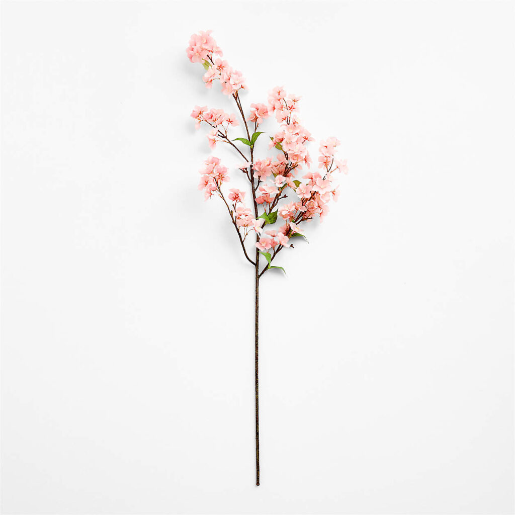
2. Faux Cherry Blossom Stem
The art establishes a cherry blossom theme—faux stems bring it into three dimensions. Artificial cherry blossoms provide year-round personality without maintenance. This isn’t random florals; it’s an intentional design decision that echoes the wall art.
How to use it: Style 2-3 stems in a vase on the counter or at one end of the shelf. The height draws the eye up and creates vertical layers.
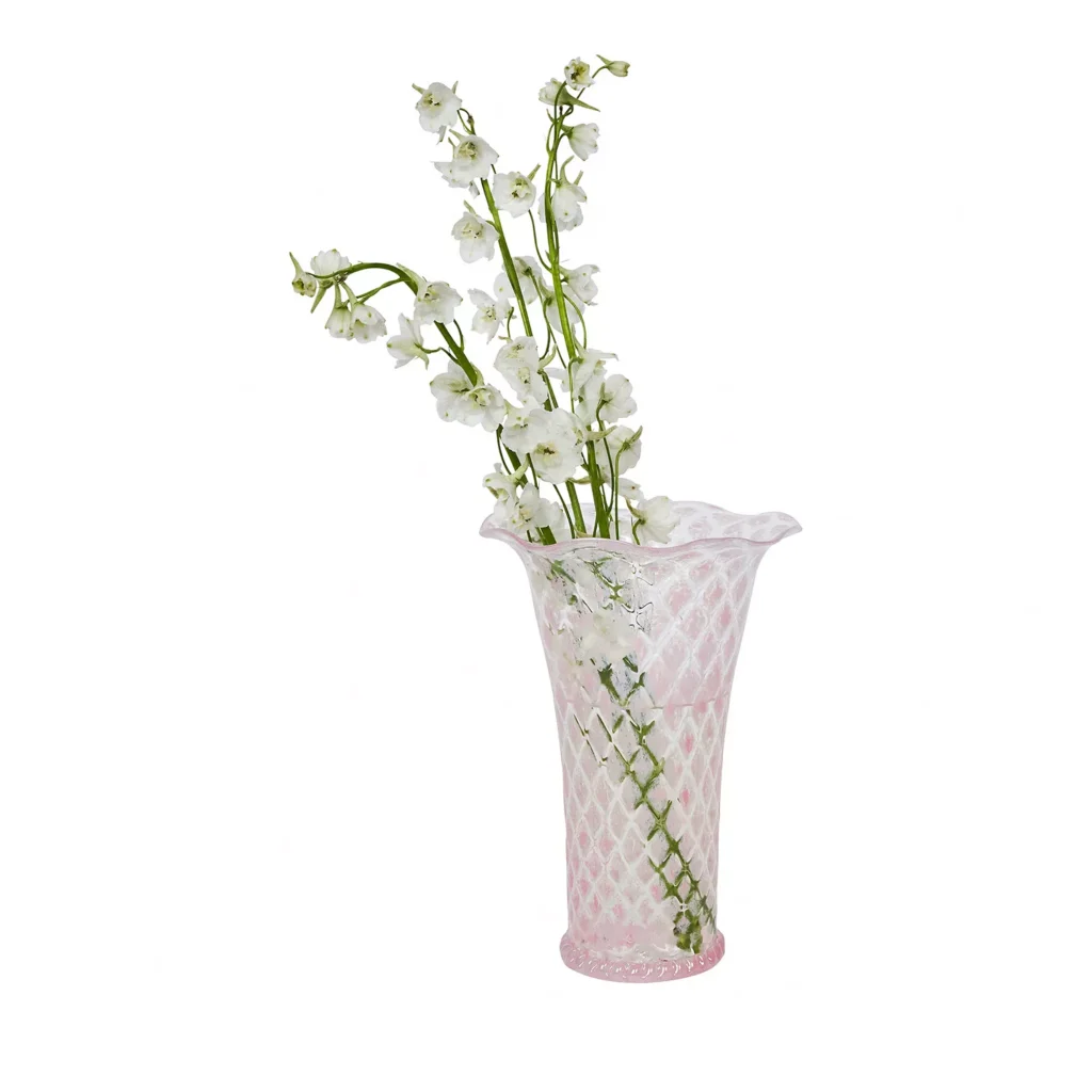
3. Pink Trellis Vase
The pink trellis pattern on this vase adds texture and pattern interest while coordinating with other elements (like the garden trellis napkins). It’s substantial enough to hold branches and becomes a decorative object even when empty.
How to use it: Pair it with the cherry blossom stems to create a complete floral moment that echoes the wall art. The trellis pattern prevents it from reading as too plain.
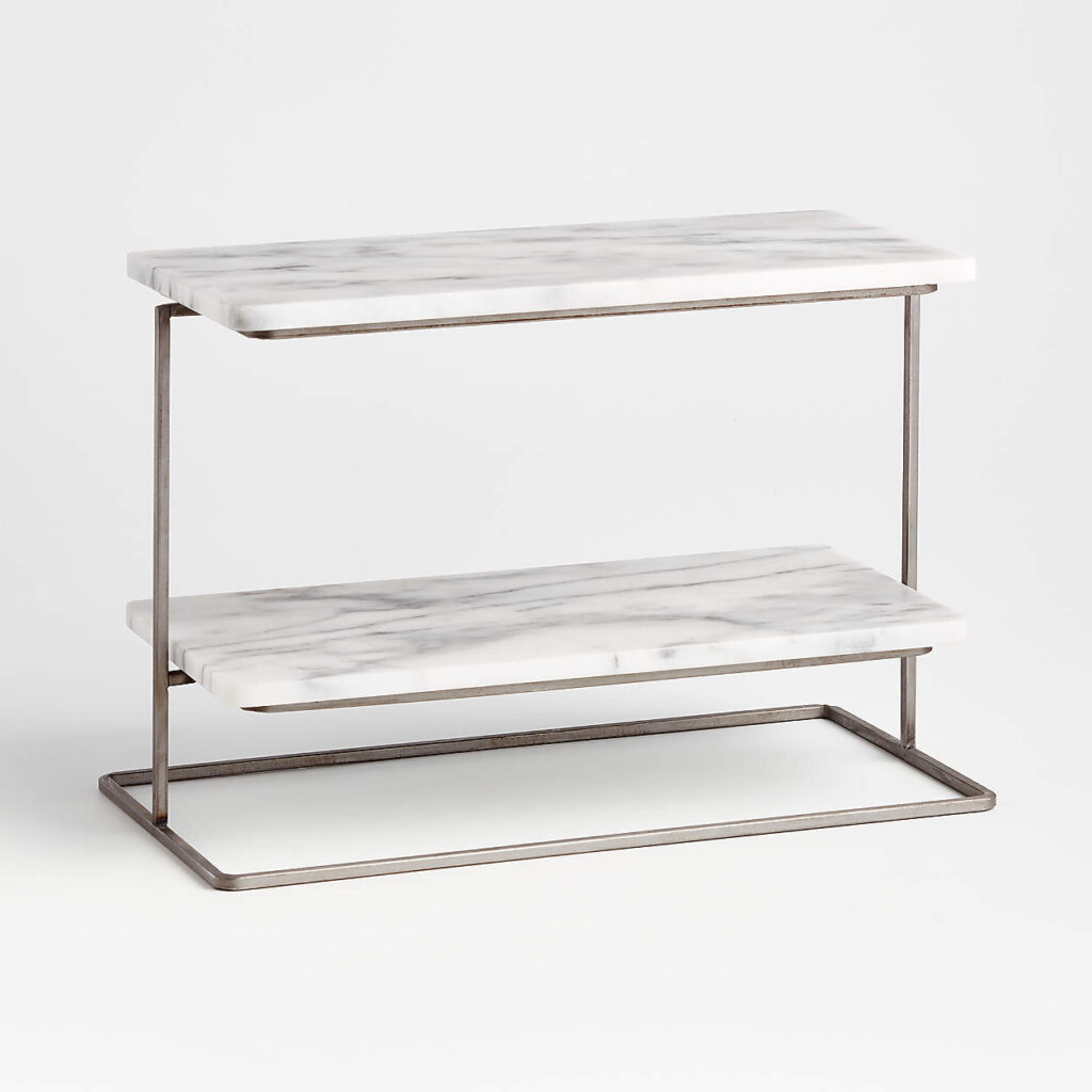
4. Marble Two-Tier Server
This solves the flat countertop problem by adding vertical storage that feels decorative rather than utilitarian. The white marble keeps the palette light and provides material contrast against the pink cabinets.
How to use it: Bottom tier holds everyday mugs. Top tier displays the pink canister or other decorative storage. This creates an organized vignette with multiple levels instead of items scattered across the counter.
5. Pink Scalloped Tray
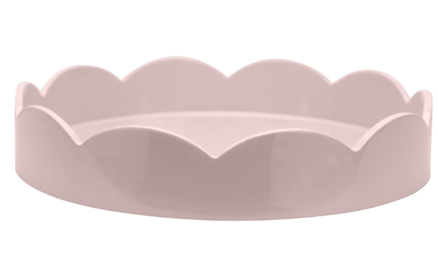
Trays group items into intentional arrangements rather than letting accessories sit randomly. The scalloped edge adds feminine detail without reading as cutesy. Pink keeps the color story cohesive.
How to use it: Corral the cream, sugar, and napkins on this tray. It becomes a self-contained coffee service vignette that looks styled, not scattered.
6. Pink Checkered Canister
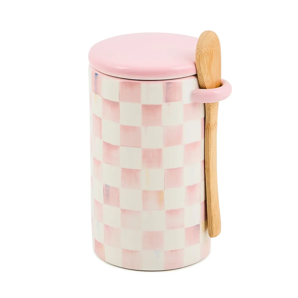
Storage doesn’t have to be boring. This canister provides function (coffee bean storage) while adding pattern and visual interest. The checkered pattern prevents the space from feeling too monochromatic.
How to use it: Display it on the top tier of the marble server. The geometric pattern creates a focal point and adds personality to everyday storage.
7. Pink Keurig Coffee Maker
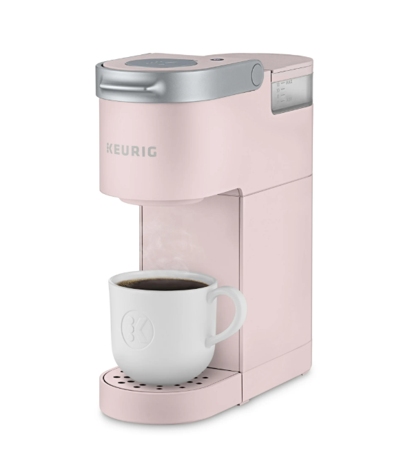
Most coffee bars hide the coffee maker or treat it as a necessary evil. If you’re committing to a pink coffee bar, commit fully. A pink coffee maker turns the appliance into part of the design statement rather than something to work around.
How to use it: Place it prominently on the counter. It becomes part of the color story rather than a functional outlier.
8. Latte Mug Set with Wood Lids
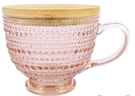
The jadeite collection establishes vintage appeal, but these pink hobnail glass mugs with wood lids add texture while staying in the contemporary pink palette. The hobnail texture creates visual interest, and the wood lids introduce natural material warmth. The gold spoons included in the set provide the metallic accent.
How to use it: Display them on the bottom tier of the marble server or on the shelf alongside the jadeite collection. The hobnail texture catches light and adds visual dimension. Use the included gold spoons as part of the coffee service tray.
9. Garden Trellis Napkins
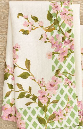
Pattern prevents a space from feeling flat. These napkins bring in the trellis motif that appears on the vase, creating pattern coordination across the coffee bar. The pink and green palette ties directly to the cherry blossom theme.
How to use it: Fold them on the scalloped tray alongside the cream and sugar. They add textile texture and reinforce the color story.
10. Pink Raffia Handmade Box
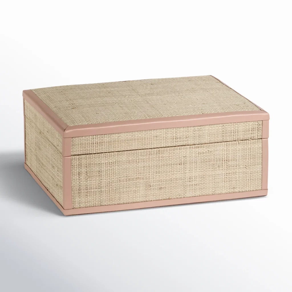
This introduces natural texture—the raffia weave adds warmth and breaks up the hard surfaces of glass, marble, and ceramic. It’s storage that doubles as decor.
How to use it: Use it to store coffee pods, tea bags, or extra napkins. The woven texture and pink trim add organic material interest.
11. Ivory Pitcher
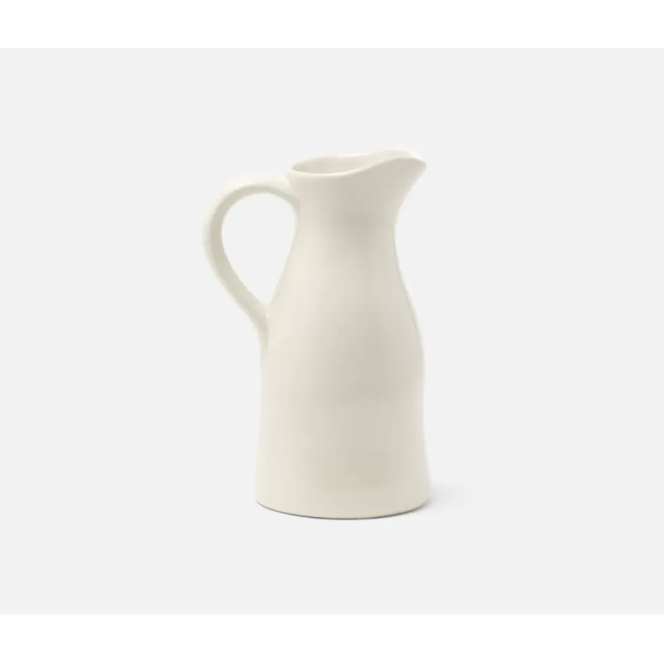
Not everything needs to be pink. This ivory pitcher provides visual breathing room and introduces a neutral that keeps the space from feeling too matchy. It works with the jadeite collection’s vintage aesthetic. It’s functional for cream or milk but elegant enough to display empty.
How to use it: Place it on the scalloped tray as part of the coffee service vignette, or use it to hold faux flowers or branches for a different look.
12. Pink Marbled Sugar Bowl
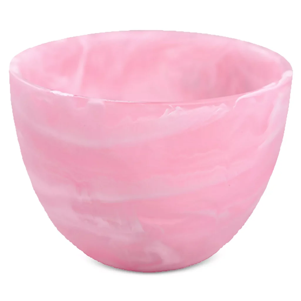
The marbled finish adds pattern and movement without competing with the other elements. It’s pink but with depth and variation that keeps it interesting.
How to use it: Style it on the scalloped tray with the ivory pitcher and napkins to create a complete coffee service moment.
How These Pieces Work Together: The FLOWS Formula
These twelve accessories transform the original coffee bar by addressing the “Styled” component of the FLOWS methodology:
Fully stocked – The canister, storage box, and serving pieces ensure everything needed is present Layered – The tiered server, vase with cherry blossom stems, and wall art create multiple levels of visual interest Organized – The tray groups items into intentional vignettes rather than scattered placement Within reach – Everything remains accessible while looking styled Styled – Pattern (checkered, trellis, hobnail), texture (marble, raffia, ceramic, wood), and coordinated color create personality
The transformation isn’t about quantity—it’s about adding the specific elements that create cohesion and character. The cherry blossom theme runs from wall art to stems to napkin pattern. Pink ranges from solid to marbled to checkered, preventing monotony. Gold accents from the mug set spoons tie metallic moments together. Natural materials (marble, raffia, ceramic, wood) add warmth. The existing jadeite collection gets supporting players that work with its vintage aesthetic rather than competing.
The Key Styling Moves
Build out the collection. The existing jadeite pieces establish a vintage-inspired collecting habit. To fill the shelves properly, add more jadeite (creamers, bowls, cups) or introduce complementary collectibles—vintage pink glass, white ironstone, or brass candlesticks. Collections need volume to register as intentional rather than sparse. Aim for grouped multiples (3-5 jadeite pieces together) rather than single items dotted around.
Create an art-to-object echo. The cherry blossoms on the wall are reinforced by the stems in the vase and the floral pattern on the napkins. This repetition feels intentional rather than random.
Use trays to group. The scalloped tray turns cream + sugar + napkins from scattered items into a composed vignette. It signals “this is styled, not just sitting here.”
Add one statement art piece. The framed print does heavy lifting—it transforms a blank wall into a focal point and establishes the design direction for everything else.
Introduce texture through materials. Marble, hobnail glass, raffia, and ceramic prevent the space from feeling one-note even though the color story stays tight.
Display functional items beautifully. The coffee maker, mugs, and storage boxes aren’t hidden—they’re part of the design when chosen in coordinating finishes.
What This Coffee Bar Still Needs
These accessories transform personality, but they don’t solve every gap:
Task lighting. If this coffee bar is used in early mornings, under-cabinet lighting or a small table lamp would improve function.
Drawer organization. If there’s a drawer below, dividers for coffee pods, filters, or accessories would complete the “Organized” component.
Personal touches. Once the foundation is styled, personal elements—a favorite mug collection, a specific coffee ritual tool—can layer in without cluttering.
The point isn’t to buy all twelve items. The point is to understand what’s missing and why. A pink coffee bar with good bones needs wall interest, vertical layers, grouped vignettes, and textural variety. These specific pieces show how to add personality systematically rather than randomly.